Pick Me – Archiving
- Year: 2022
- Category: Printed
- Technique: Digital printing
- Link: pickme.today
- Featured on Herbert.gd
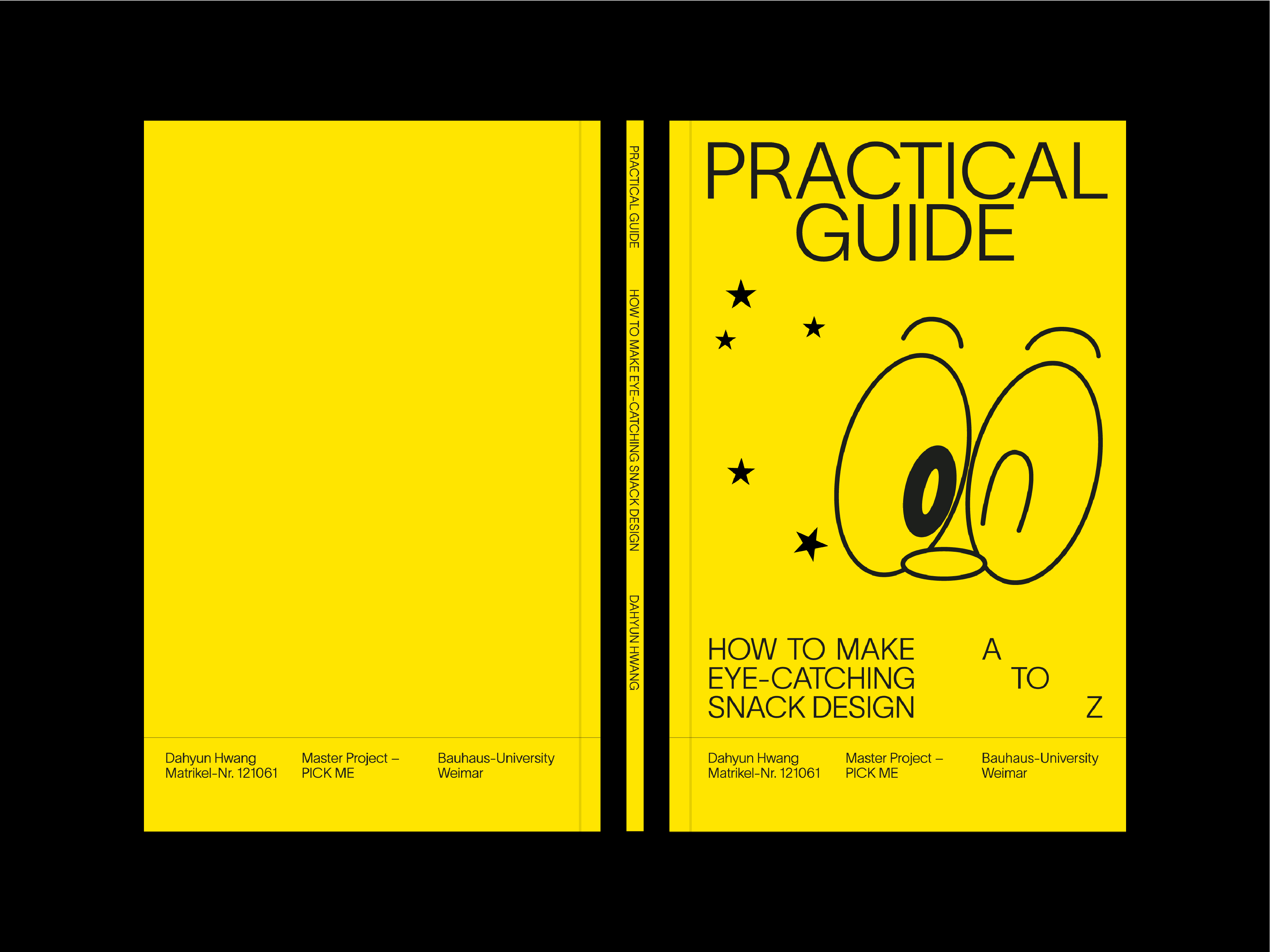
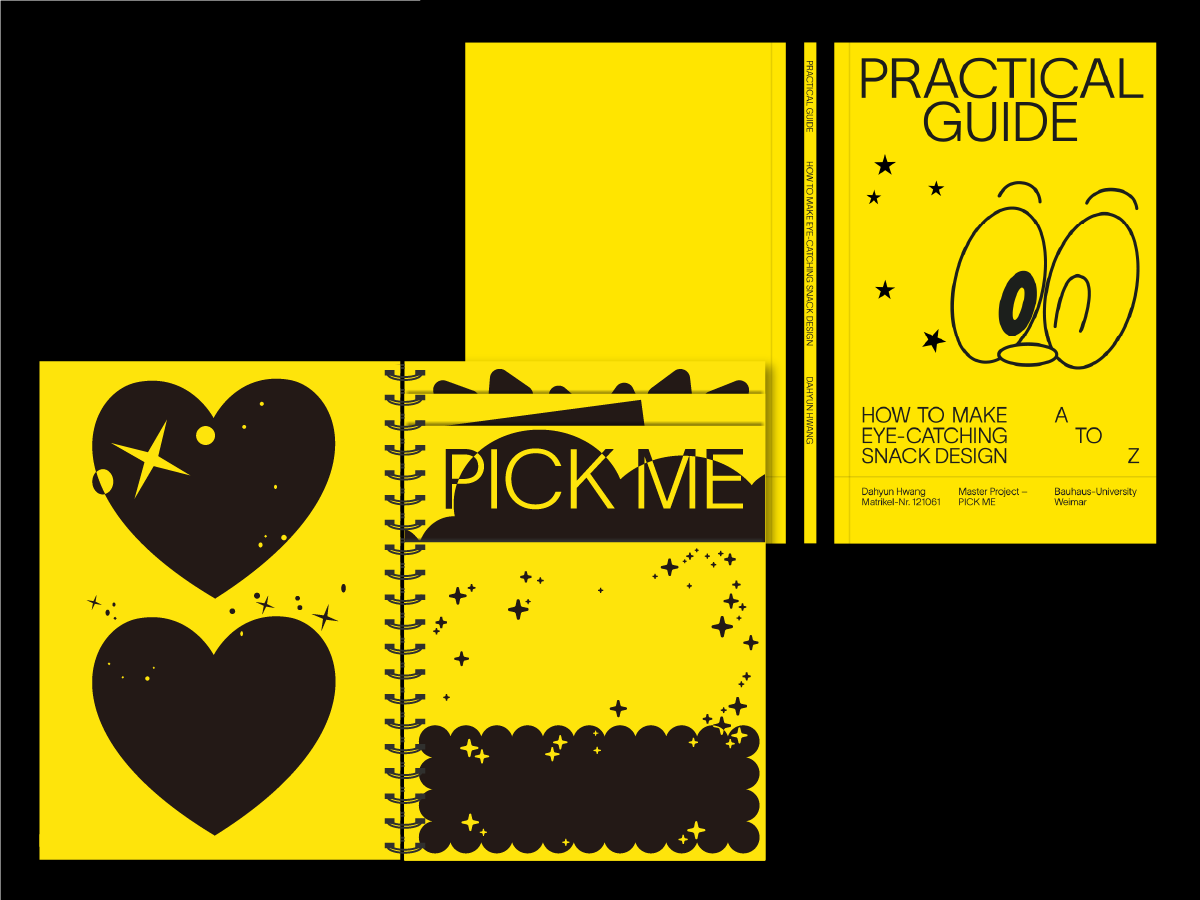
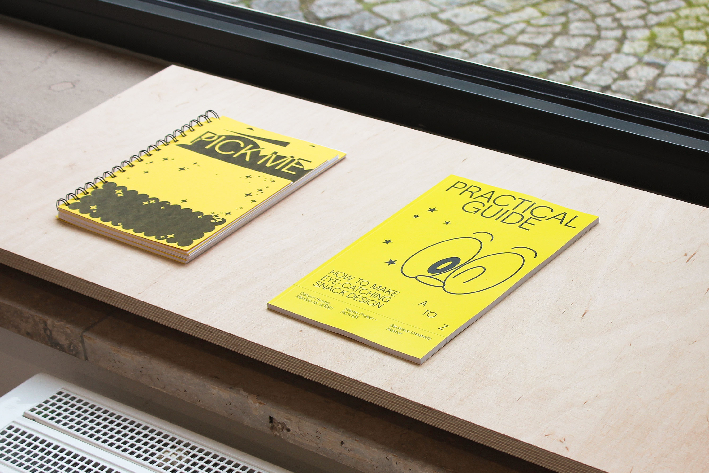
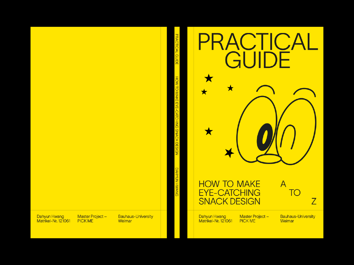
How to make eye-catching snack Design
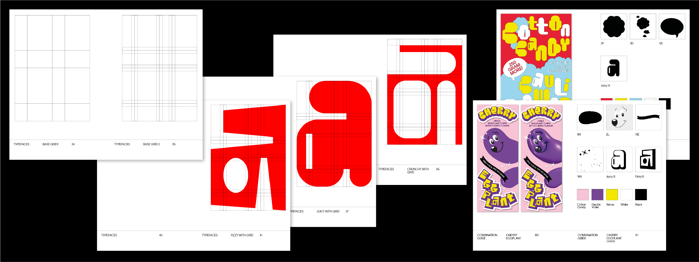
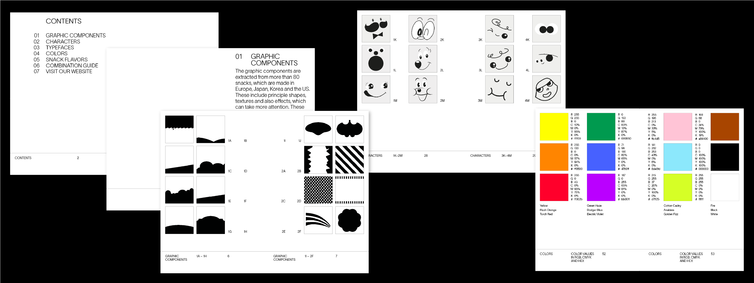
We often face dilemmas in the supermarket. Because the fun and colorful designs of the snack corner catch the eyes of everyone, especially children. But can’t these playful designs be used for better snacks that aren’t unhealthy processed foods? These concerns inspired this project. One study found that over 50% of a chosen group of children chose broccoli when given a normal-looking chocolate bar and broccoli with a cute character on it. In this way, I thought designers can make the world a better place. So I wanted to use the eye-catching graphic elements of the existing snack designs to make new kinds of snacks with better intentions. For that process, I made a list of 80 snacks collected from the US, Europe, Japan, and South Korea and conducted a research. Simplified graphic elements, mascot faces, and colors were extracted from the existing packages, and three different fonts were created for new snack packages. Each of the three different fonts are made using a grid system, in order for them to be uniform even on a design. All the created graphics consist of graphic elements extracted from the existing snack packages.
We often face dilemmas in the supermarket. Because the fun and colorful designs of the snack corner catch the eyes of everyone, especially children. But can’t these playful designs be used for better snacks that aren’t unhealthy processed foods? These concerns inspired this project. One study found that over 50% of a chosen group of children chose broccoli when given a normal-looking chocolate bar and broccoli with a cute character on it. In this way, I thought designers can make the world a better place. So I wanted to use the eye-catching graphic elements of the existing snack designs to make new kinds of snacks with better intentions. For that process, I made a list of 80 snacks collected from the US, Europe, Japan, and South Korea and conducted a research. Simplified graphic elements, mascot faces, and colors were extracted from the existing packages, and three different fonts were created for new snack packages. Each of the three different fonts are made using a grid system, in order for them to be uniform even on a design. All the created graphics consist of graphic elements extracted from the existing snack packages.